Blog — "challenge"
Design a Day Challenge: Day 10
Heidi Shenk "cards" "challenge" "design a day" "design" "stationery"


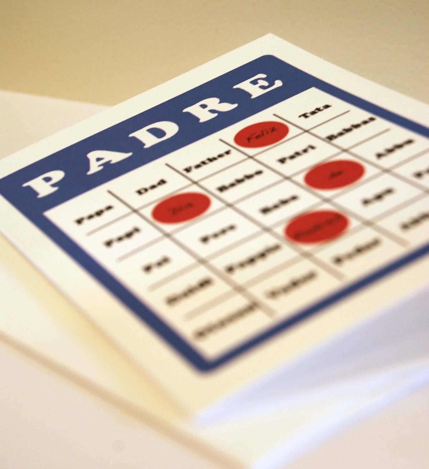
Can I just say, there is nothing better than some super bold and fun colors on crisp, clean card stock! Yup-- still addicted to this white linen! In fact, I may just order up some more of it! Nothing like getting a vibrant and clever little greeting card in the mail. If I were you, I'd be snatching these up, but then again I would say that since I designed them, wouldn't I? ;)
Design a Day Challenge: Day 8
Heidi Shenk "cards" "challenge" "design a day" "design" "invitations" "save the dates" "stationery"
So as you can see-- I love, love, LOVE these colors!
For today's design, I went with aqua, yellow, and gray (go figure!) and made a simple yet contemporary save the date.


I'm a simple kind of person-- I don't like too much frill. So this design seems to exemplify just that. Simple yet contemporary. No frills, just perfectly simple!
Design a Day Challenge: Day 7
Heidi Shenk "cards" "challenge" "design a day" "design" "envelopes" "stationery"

And then the more I thought about it, even my own family is bilingual speaking both French and English-- it just makes sense. Everyone likes to send and receive snail mail so why not do something in several languages?
So the end result is this simple card that says "hi." But the fun part is that it says it in may different ways as well.


Not only are the languages super fun, but so are the colors! And just for fun, I decided to offer either a blue or green envelope to go with-- I liked both so much I couldn't decide so I thought I'd leave that open ended. So all of this talk about languages around the world. I want to know: What languages do you speak?
Design a Day Challenge: Day 6
Heidi Shenk "cards" "challenge" "design a day" "design" "Finn" "stationery"

That's Finley-- or Finn as I call him for short. He's our cute, little kitten we just brought home yesterday. He's about 12 weeks old and he's one pretty awesome little guy. This morning was absolutely crazy with Lilah, our 2 year old Chocolate Lab, and Finn playing. But once they were both settled down for long afternoon naps I had plenty of time to design-- and even bake!So here is what I came up with today. I had some beautiful blush colored cards sitting around for several months that were begging me to do something with them. Add some cream, brown, and teal colored paper in layers and you end up with some very soft and girly looking note cards. I am not much of a girly girl, but I thought these turned out beautifully!


Something about these really do remind me of a little girl-- it has to be the color scheme! I'd love to know what you think!
Design a Day Challenge: Day 5
Heidi Shenk "cards" "challenge" "crafts" "design a day" "design" "stationery"


The stamp design itself made me want to design these as postcards to pop in the mail, but instead I paired them with a light gray linen envelope for fear that they would get messed up in the mail. Thus the header design rather than a full out patchwork that I had originally intended.
For now, I'll be working on tomorrow's design. I have a busy week ahead, including introducing a new member into our household (more on that later) and a visit from my parents next weekend. This will definitely be challenge to keep up with my design-- here's to hoping I can stick with it! Enjoy the rest of your Sunday and your weekend! I'll be gearing up for week two of summer break! :)
